
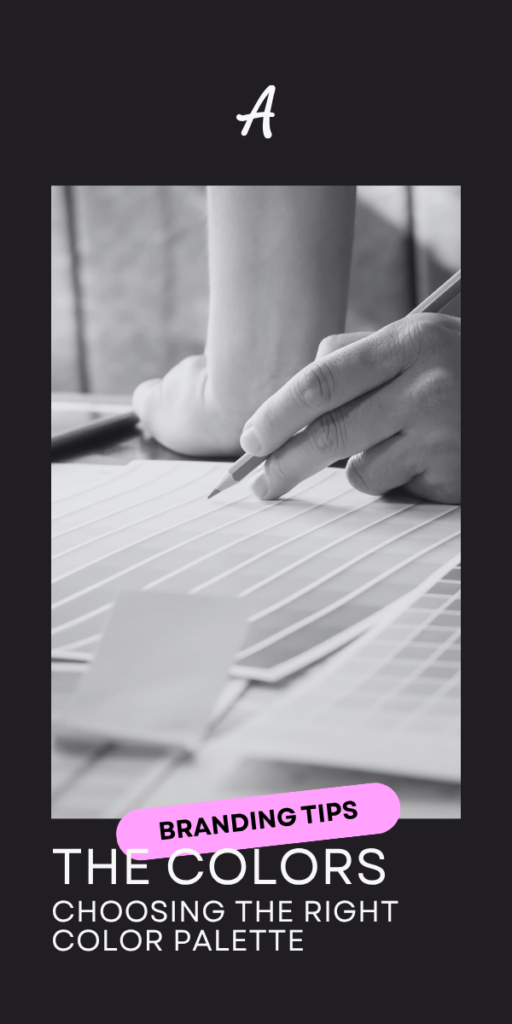
Visual communication is everywhere. Advertising, posters, leaflets, menus, websites… Design is part of our daily lives, but do we really see it? A well-thought-out color palette doesn’t just beautify your brand. It plays a crucial role in ensuring that your message is understood by everyone, especially on the web. Disorders such as color blindness, astigmatism or other vision problems can render an attractive palette completely ineffective.
And even if you’re not visually impaired, it can be difficult to assess whether a palette is truly accessible. Fortunately, there are some basic rules, and we’re here to help you discover them.
Why are colors so important?
First, it’s important to understand why a single color palette is essential. You could go for simplicity and design visuals in black and white, a tried-and-tested contrast. But colors aren’t just a matter of style: they set the tone, the mood and the soul of your company.
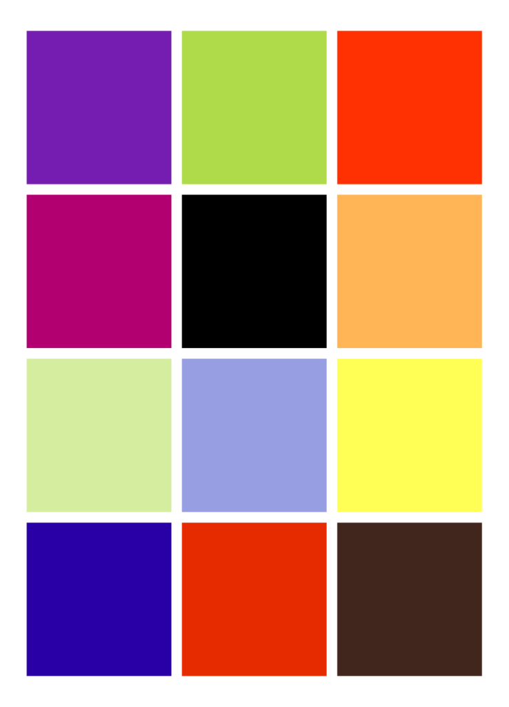
If your company is clearly recognizable by its logo or slogan, it should be just as recognizable by its color palette. Let’s do the test with the colors below. By their arrangement alone, they should certainly ring a bell:

Even if your eye doesn’t linger on the details, certain colors will speak to you and immediately evoke a company. That’s what you want to achieve with your own palette, and to do so, you need to choose and use your colors well.
Choosing colors, yes. But how do you use them properly?
Creating an effective palette doesn’t mean giving up on aesthetics. Here are a few essential guidelines for building a solid foundation.
Color theory
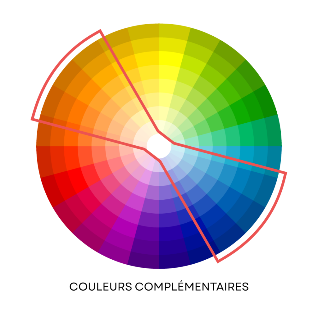
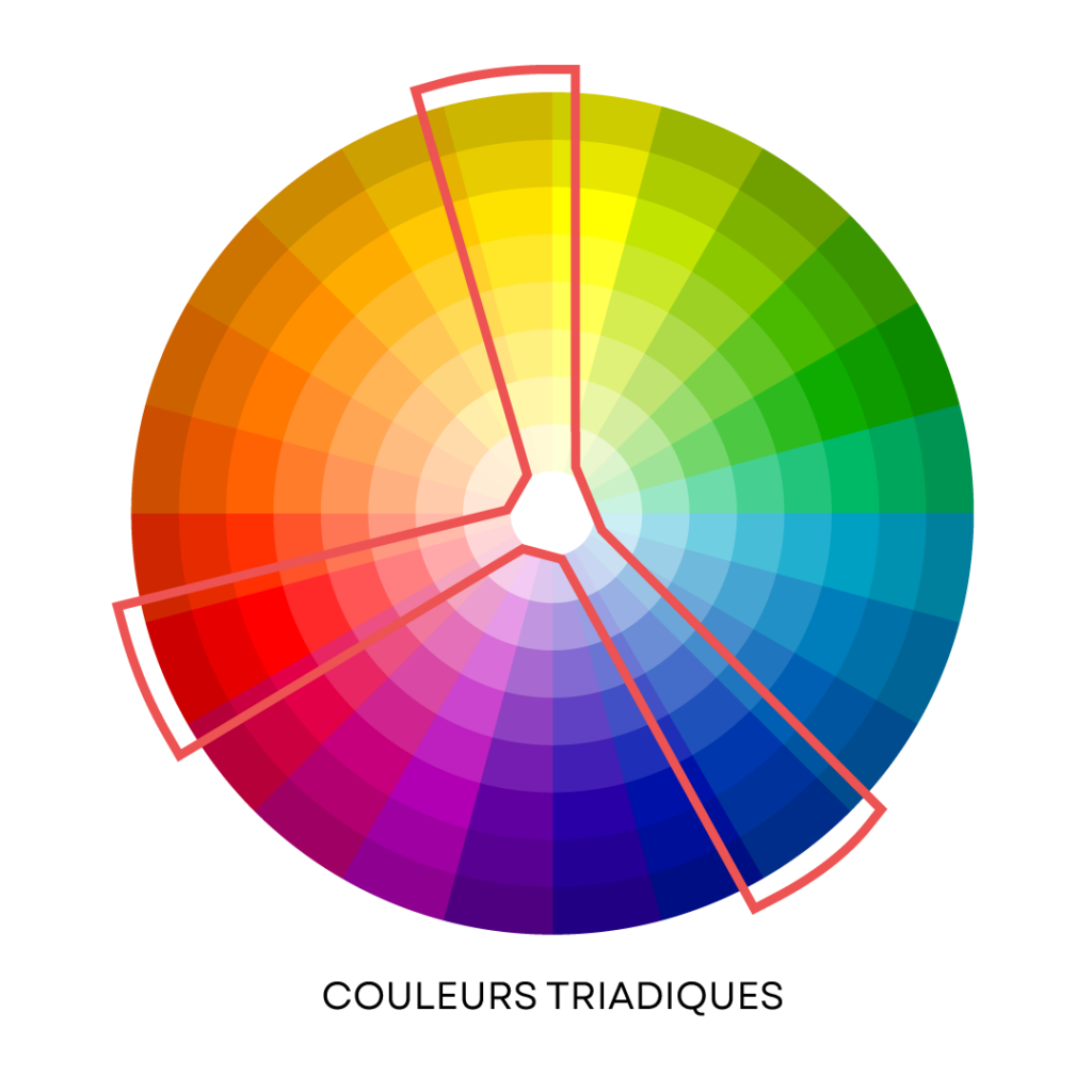
This is the starting point. Color theory is based on the color wheel, which groups together the hues of the rainbow to build coherent visual harmonies, rather like a recipe of complementary flavors.
Here are some classic combinations:
- Complementary colors: on opposite sides of the circle. For example, orange and blue create a strong, dynamic contrast.
- Analogous colors: side by side on the circle, such as pink, red and orange. The result is soft and harmonious.
- Triadic colors: equidistant on the circle, such as red, blue and yellow. A balanced composition, lively and full of energy.

Colors carry a message
No color is neutral. Each hue evokes emotions or ideas. For example:
- Blue: confidence, reliability, calm (often used in finance or technology).
- Red: energy, passion, urgency (very present in sports and sales).
- Green: nature, growth, health (associated with ecology or community services).
- Yellow: optimism, creativity, dynamism (popular in children’s worlds).
Being aware of the meaning of colors helps to build a coherent and intentional visual identity. Choosing a color isn’t just an aesthetic decision: it’s about choosing what you want it to feel like.
Neither too much nor too little
A good palette is a balanced palette.
- Too few colors: you’ll lack the flexibility to distinguish elements, structure your content or prioritize information. This can quickly become monotonous, even unreadable if contrasts are insufficient.
- Too many colors: you risk losing coherence, blurring your message and visually tiring your users. An abundance of hues can make your design confusing or amateurish.

In the example above, one of the two palettes should immediately appear more harmonious and visually pleasing, while the other is more chaotic. In general, we recommend a palette of five to six well-chosen colors. It’s a happy medium that keeps things clear, consistent and versatile.
Strong contrasts for improved legibility
Contrasts are essential on the web. Pale gray text on a white background, no matter how elegant, may never be read. And this problem is even more acute for people with reduced vision or visual impairments.
Did you have trouble reading this paragraph, or perhaps didn’t even notice the characters above it? That’s exactly why it’s important to have good contrast in our color palette!
Well-balanced contrasts ensure that your content is readable by everyone, whatever the screen or the user’s visual abilities. It’s a question of accessibility, but also of performance. If no one can read your message, it’s useless… no matter how pretty your design.
Screen vs. print: same colors, different results
Colors don’t react in the same way on screen as they do in print. On the web, they are displayed in RGB mode (red, green, blue), a lighting system designed for screens. This mode allows a wealth of nuances, sometimes more than print can render.
In printing, we use the CMYK mode (cyan, magenta, yellow, black), based on inks. As a result, some colors appear duller or differently than on screen.
To compensate for these discrepancies, Pantone colors are sometimes used, offering a more standardized and faithful reproduction. Defining your colors in each of these systems from the outset ensures that your image will remain consistent whatever the medium used.
What to remember?
Make sure you choose the right corporate colors for the message you want to convey. Based on your ideas and inspirations, get out the color wheel and validate whether, side by side, your colors live well together. Once you’ve taken these first two steps, you’ll certainly have no trouble getting your designs seen and recognized by everyone.
And if, despite our sound advice, you’re not yet ready to take the plunge, or even worse… you’re questioning your current color palette, let us know– we prefer to see the world in color too!