
At Alexem Studio, it’s always a pleasure to collaborate with Rio Tinto, and this logo project for the Americas Europe team is a prime example. As part of a global competition among all Rio Tinto entities, we were tasked with designing a logo that stands out while staying true to Rio Tinto’s well-established visual identity.
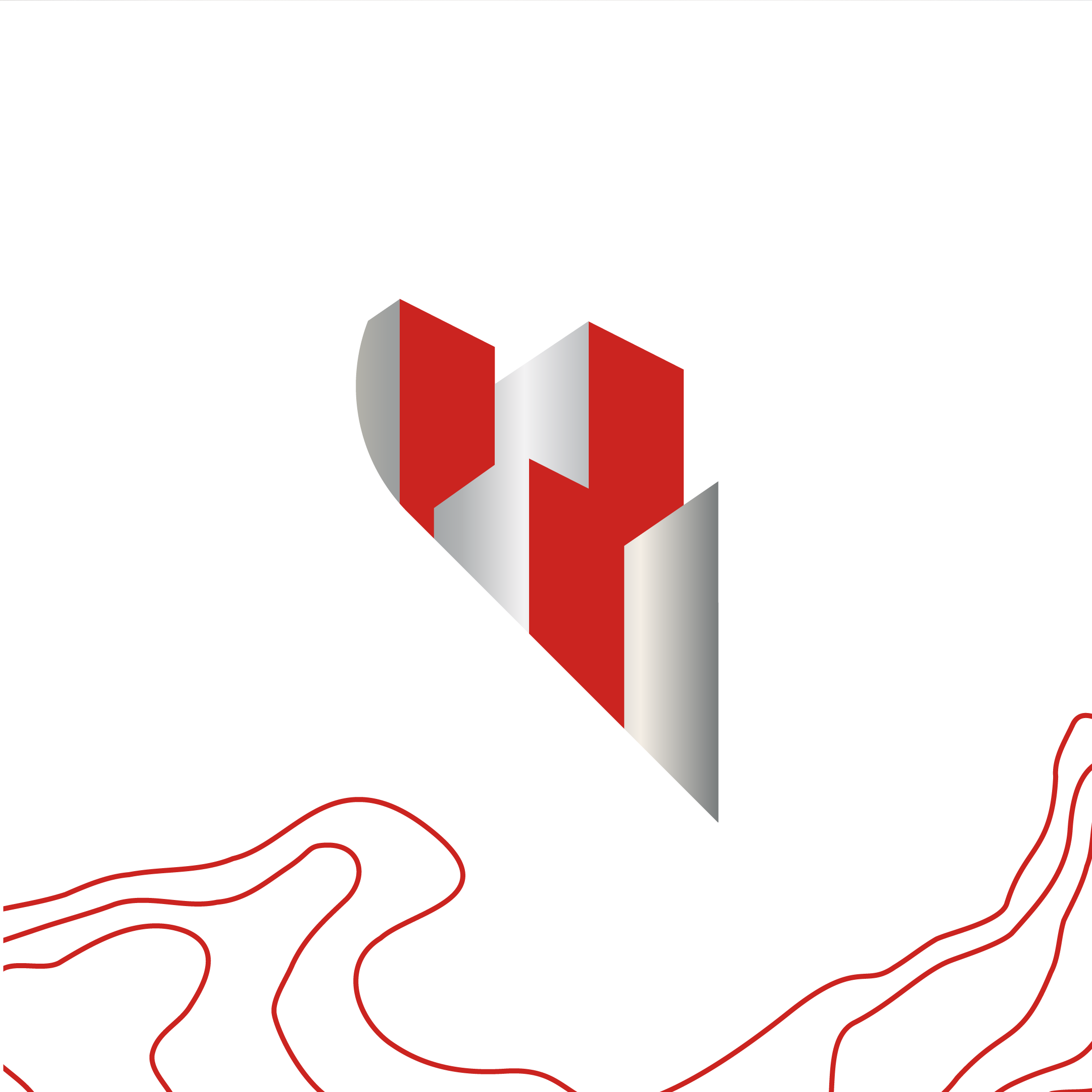
We drew inspiration from Rio Tinto’s core values—benevolence, respect, courage, integrity, and teamwork—to create a logo that embodies these fundamental principles. Several very interesting designs were proposed to the team, and the choice was challenging.
The design ultimately chosen (our favorite!) symbolically and elegantly represents the importance of growth and innovation, with elements rising up within a heart, a nod to team spirit and the company’s ongoing evolution.
We take great pride and satisfaction in seeing our creation selected to represent the Americas Europe team on the international stage. Working with Rio Tinto is always a rewarding experience, and this project is one of those that reminds us why we love what we do so much.
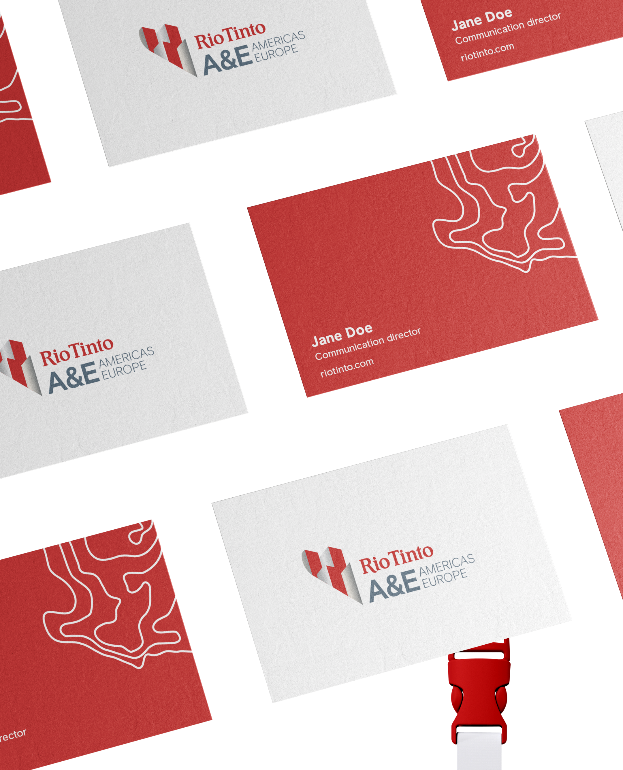
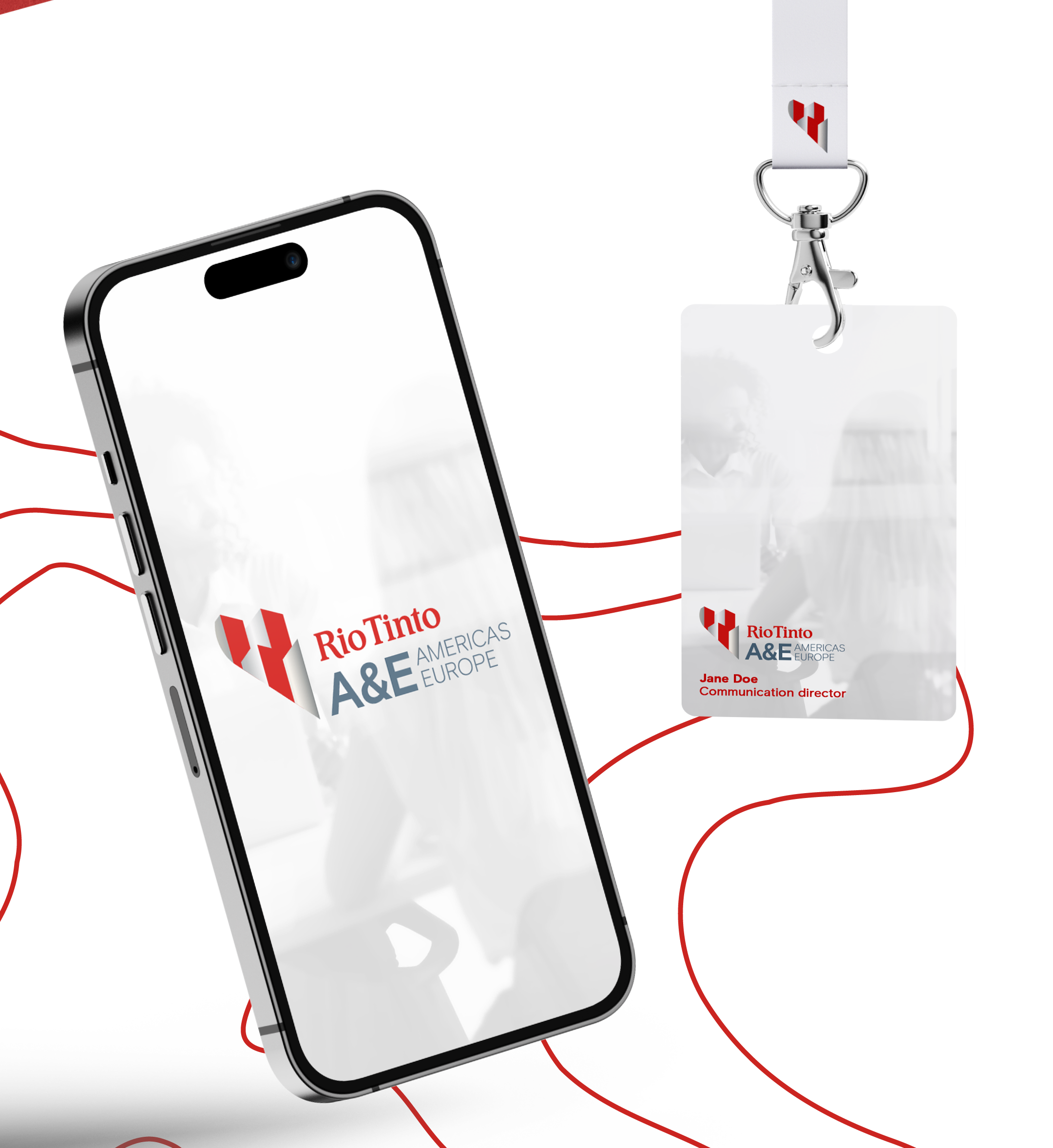
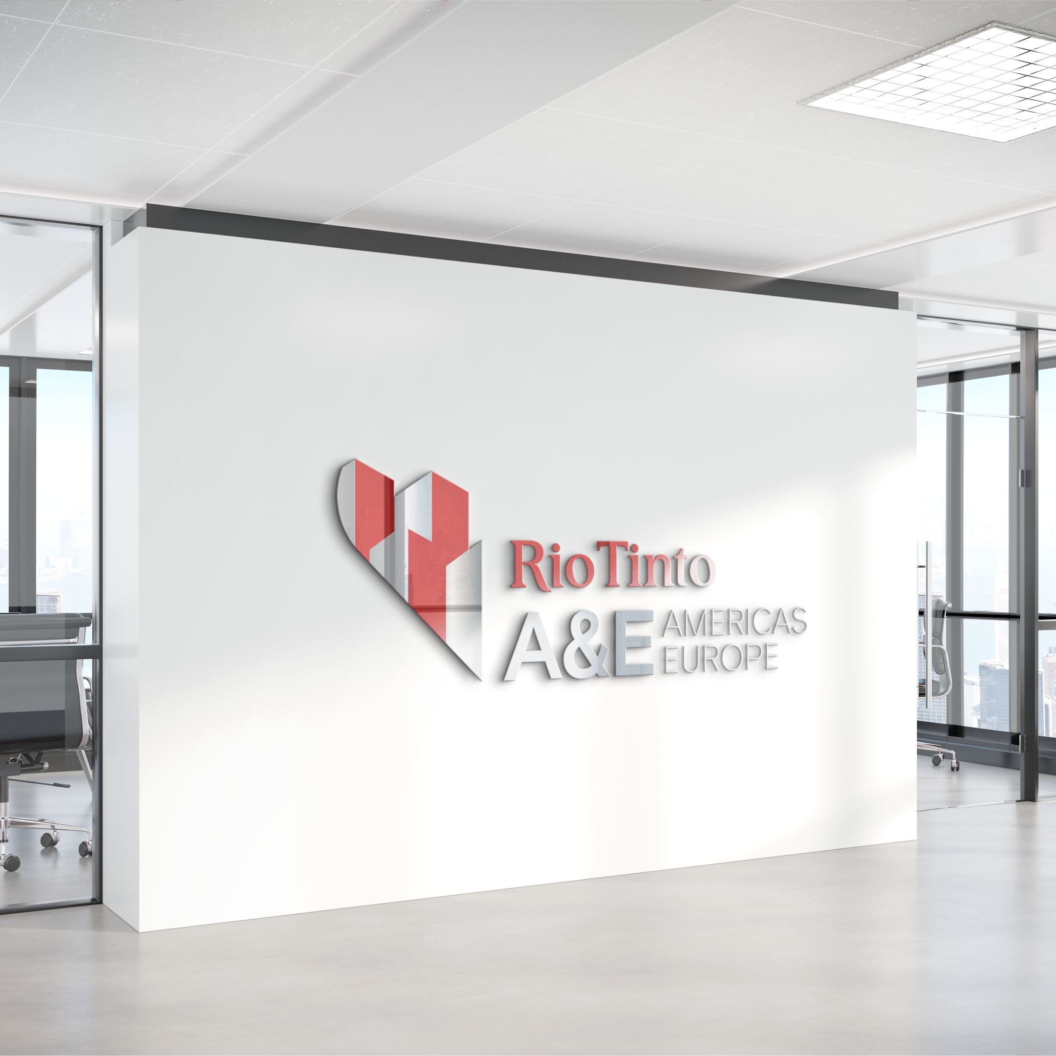
Note: The mockups presented in this portfolio illustrate potential internal uses of the logo and do not necessarily reflect its actual use.