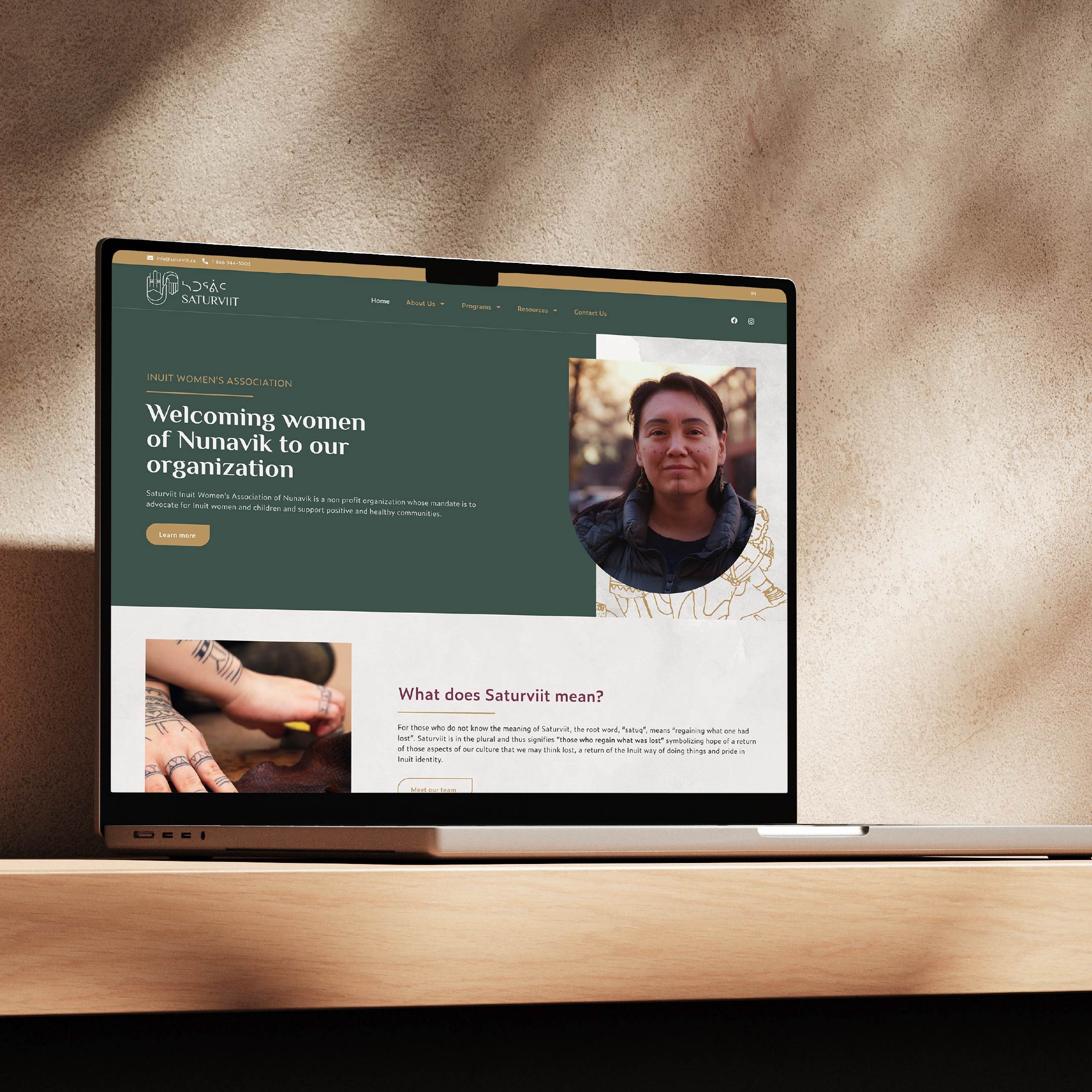
Saturviit, an association representing the Inuit women of Nunavik, strives to be their voice and to defend their interests.
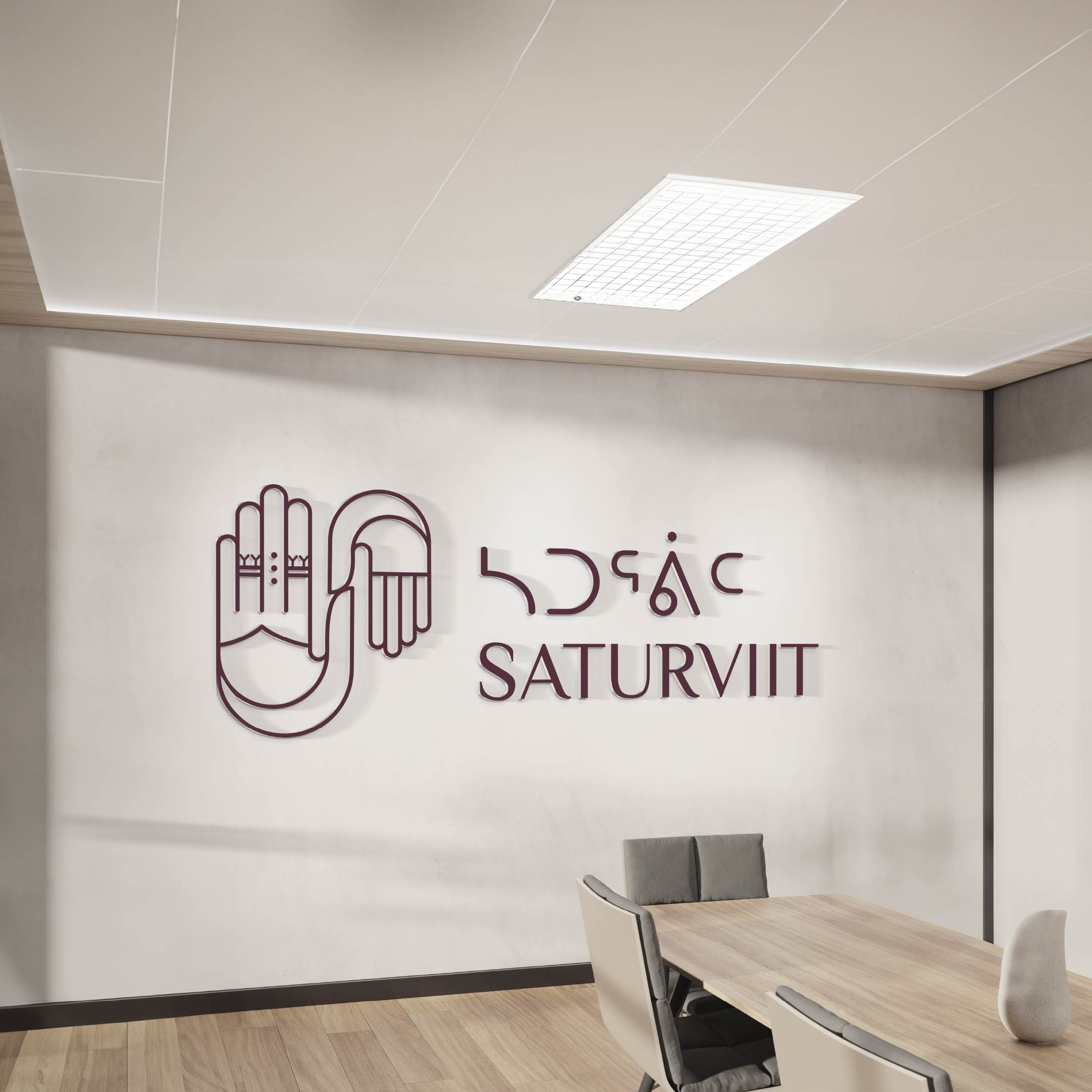
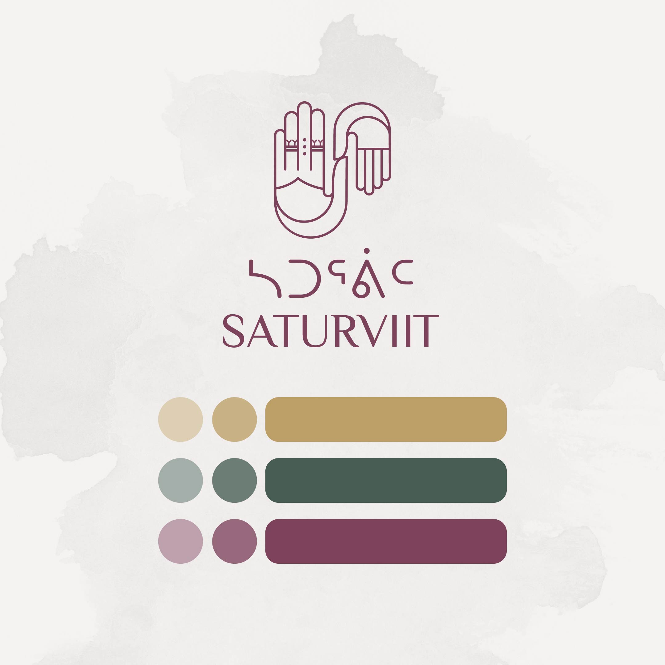
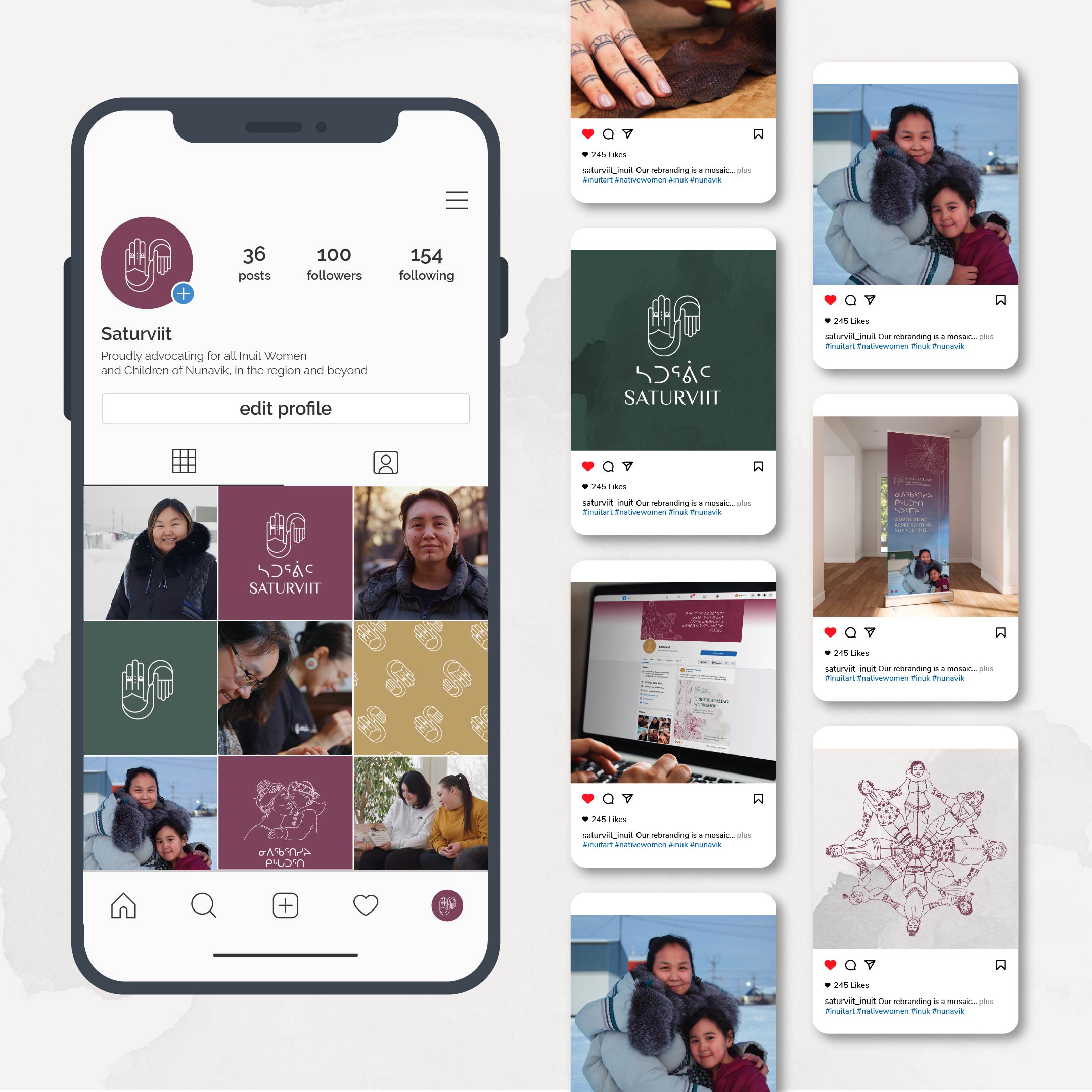
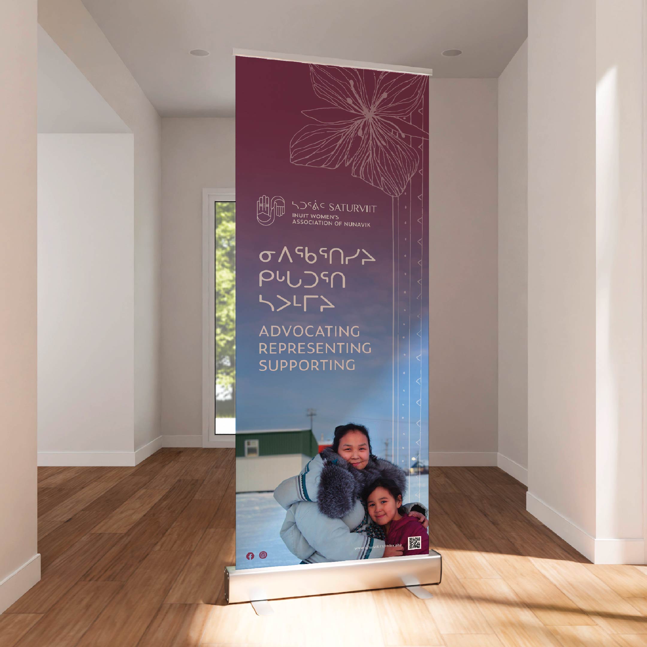
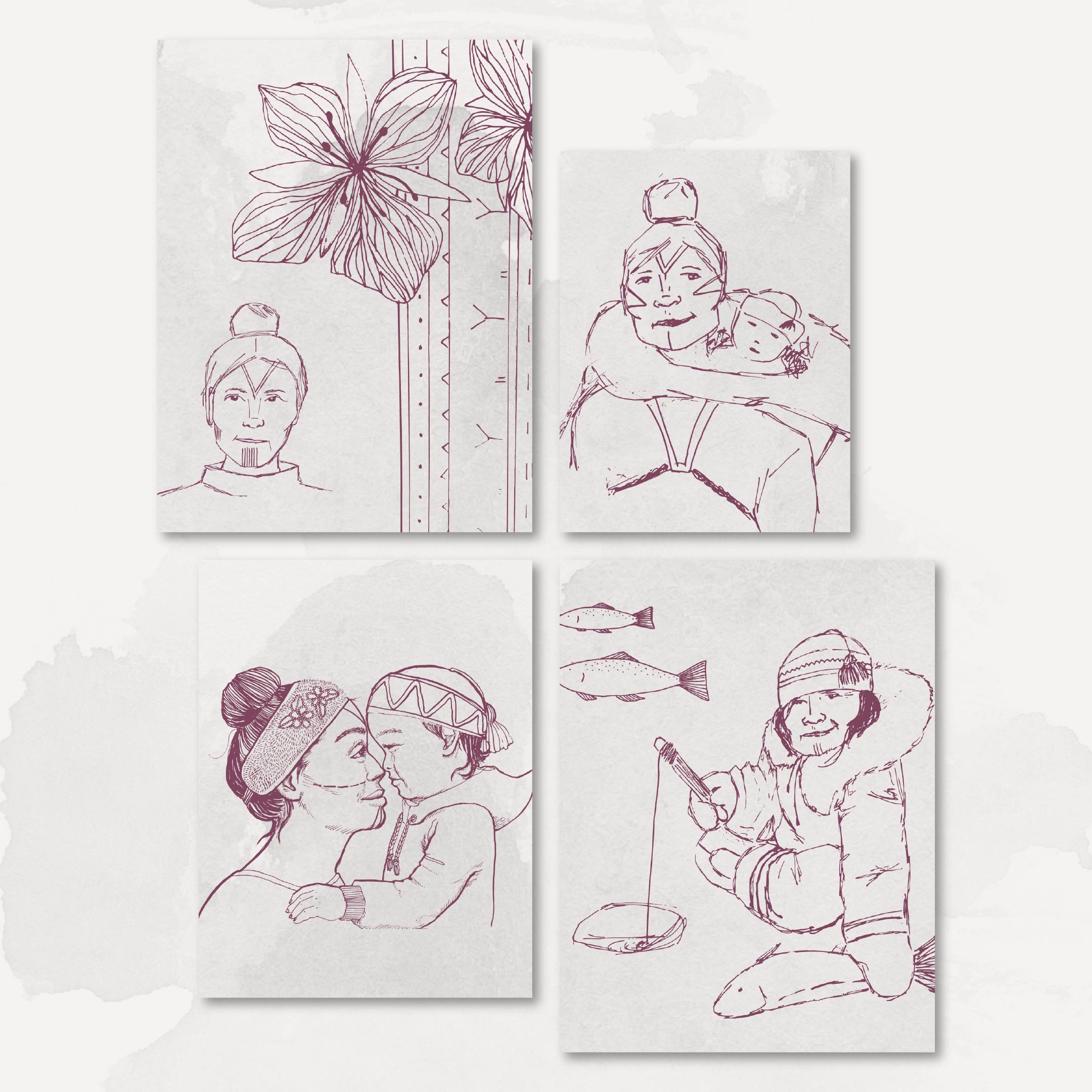
With MHC Stratégies at the helm of the project, Alexem Studio has done some in-depth iconographic work to capture the essence of this mission with respect and admiration. The new Saturviit logo is at the heart of this approach: it represents an adult hand and a child’s hand, symbolizing mutual aid, love, family and union, essential pillars for Inuit women. The delicate lines of the logo also evoke traditional tattoos, adding a touch of rich, meaningful cultural heritage.
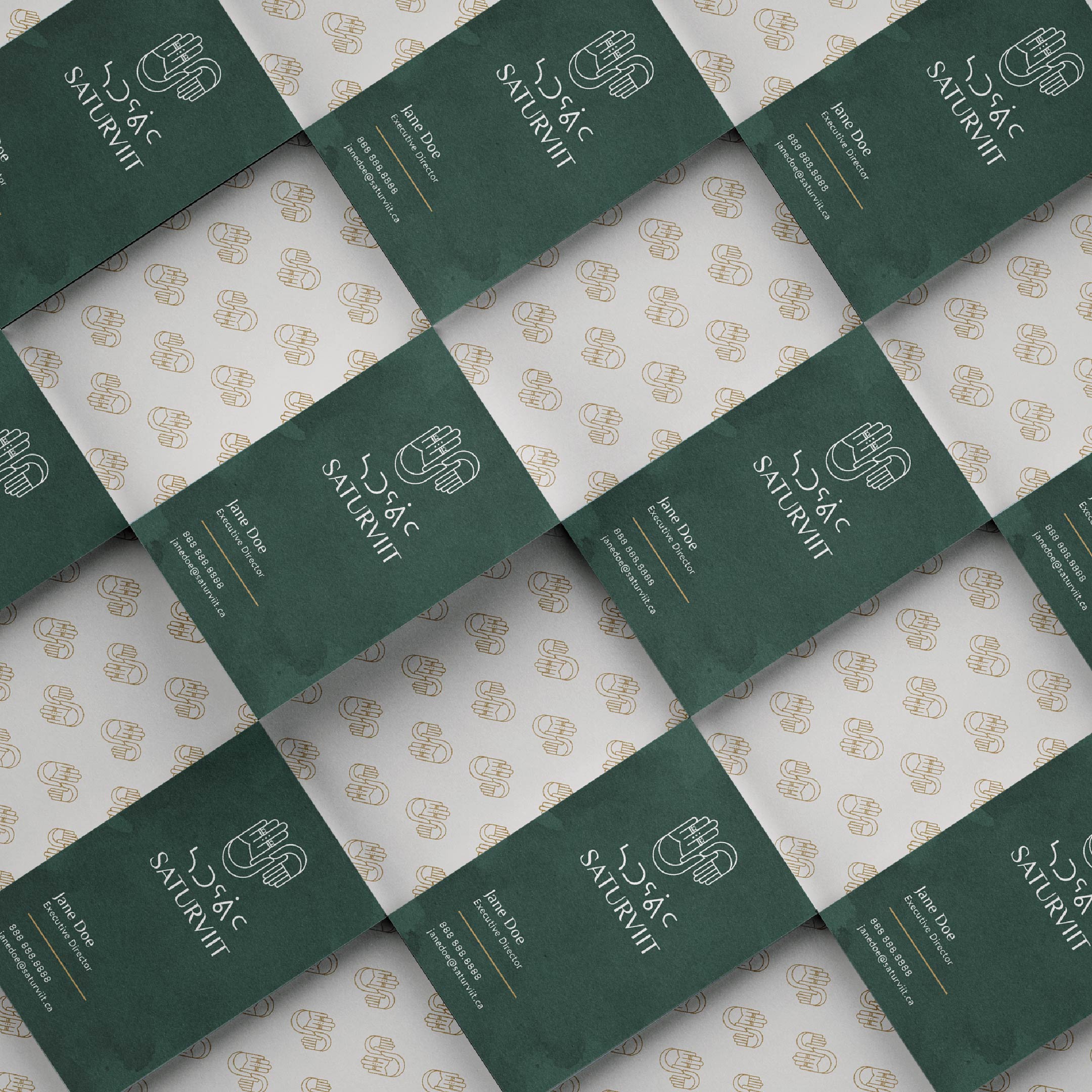
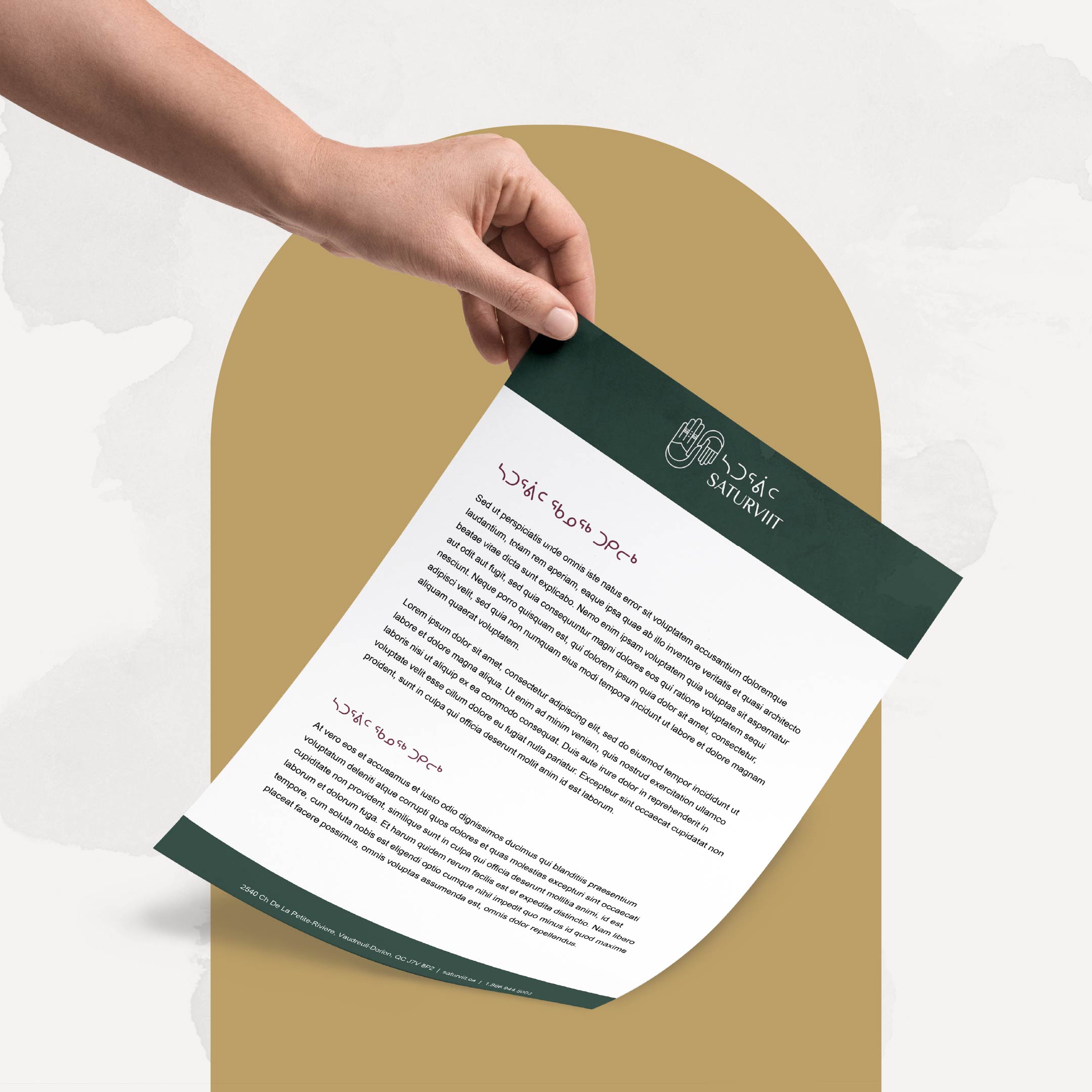
To accompany this rebranding, we developed a soft, natural color palette, featuring warm tones such as burgundy, gold and soothing shades of green and beige. These visual choices reinforce the idea of a modern identity that respects tradition.
Illustrations by Inuit artists and authentic photographs harmoniously complement this new brand image.
To complement this visual identity, we designed marketing tools and a modern, accessible website, highlighting Saturviit’s programs, resources and values.
We are proud of this project, which reflects both the heritage and the future of Inuit women, and honored to contribute to Saturviit‘s mission.