
We had the pleasure of collaborating with theAssociation du Hockey Privé du Québec (AHPQ), an organization whose mission is to support and inspire private field hockey organizations across the province. Our mandate was to design a complete visual identity as well as a website aligned with this new brand image.
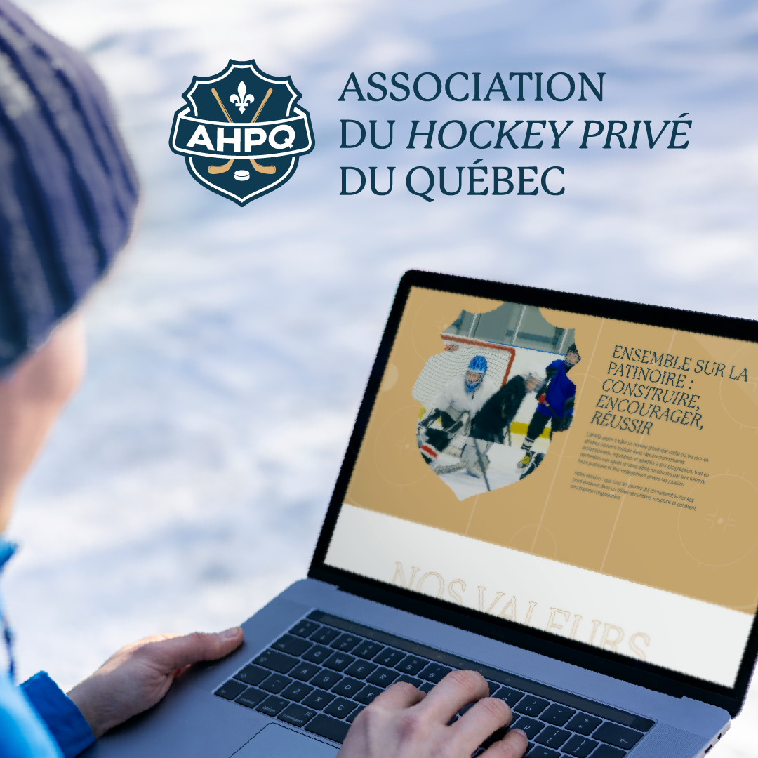
The logo, built around a crest, combines the visual codes of field hockey (crossed sticks, puck) with a clear Quebecois anchoring thanks to the fleur de lys. The palette is based on deep navy blue and warm gold, two hues that evoke both institutional rigor and sporting spirit. The typographic system relies on editorial italics to give character to the communication, while maintaining a clear, structured read.
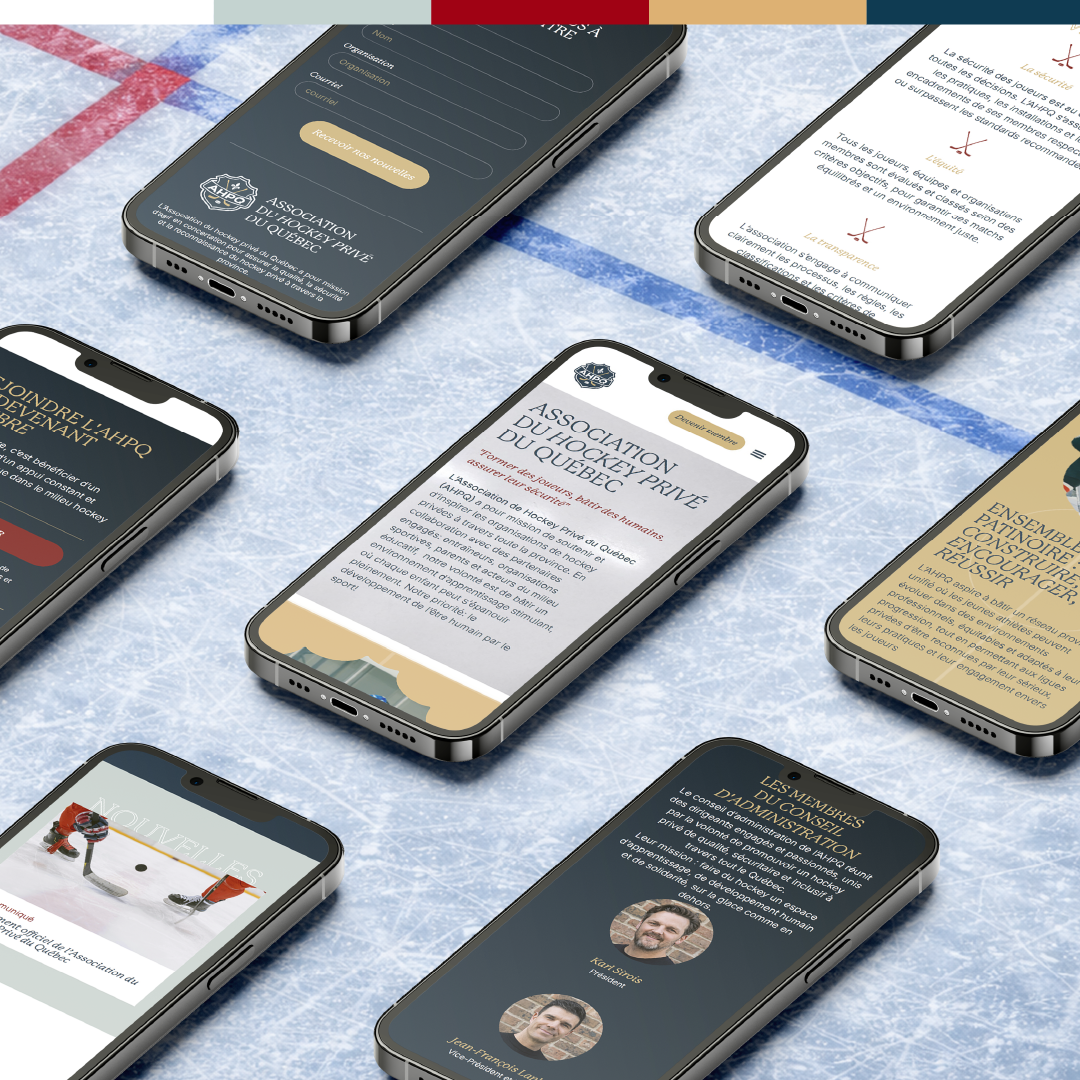
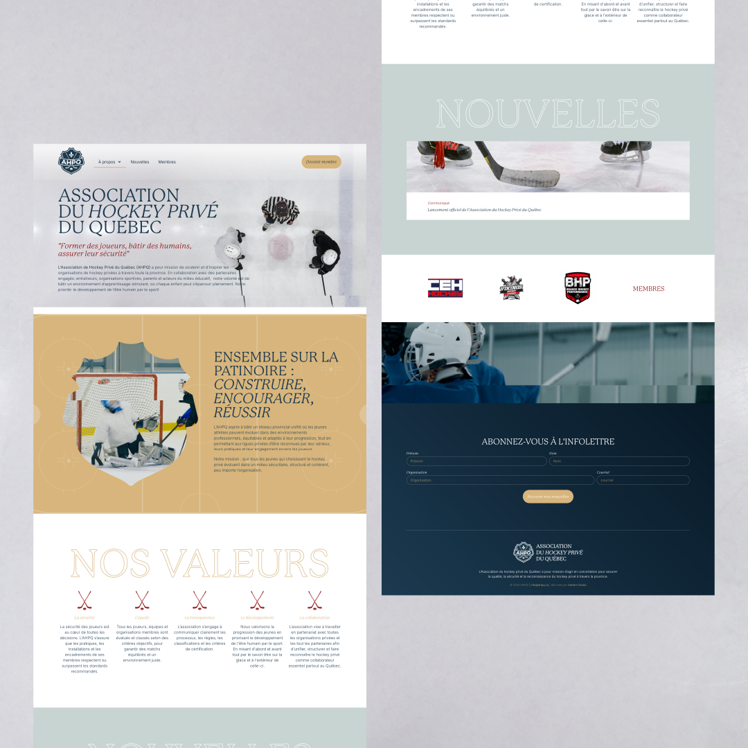
The website design is an extension of this new identity. The architecture highlights the association’s mission, values, team and membership, with a neat typographic hierarchy and sections punctuated by sports photography. The site is fully responsive and designed to evolve with AHPQ’s growth: member area, membership management, news feed and newsletter.
A project that brings together strategic design, corporate communications and the showcasing of a structuring sports community. Thanks to the AHPQ team for this wonderful collaboration.